I'm pleased by the popularity of simplicity in design. Out of the late 90's and early 00's "more is better... and even MORE is best!" aesthetic for busy busy busy graphics with as many whirligigs and wing digs as you could cram in has come what you could call design for after the hangover sets in.
I'm not a fan of Pepsi. Both the regular and the diet versions have a strange metallic tang to my palate. I drank one yesterday at Toki Teriyaki as it had been a while and with habit changes can come changed perceptions... but I still hated it.
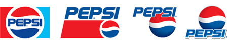
Nor am I a fan of their new logo.
It looks like a mistake. The waves were so iconic, and the motion they created were so clear and forward-moving that if I were the printer that received the new logo, I would have called the designer and said, "Whoa, something happened with one of your vector pieces there in the wave thingie; it's all f'd up."
This logo looks confused. And the direction and energy it creates is not clean and forward moving but curling back on itself in part and creating unsavory crashes of resonance. It's the area of a creek with no outlet which ends up a morass of conflicting waves.
This wouldn't work on it's own if it were a new, unknown product. But it fails doubly when it's meant to be an evolution of an existing feel.
In
Design Talk,
Before and After's blog, they have a great piece about this. (
Before and After is the single best design resource I've ever known. I originally subscribed to their print version back in... 1993? Clear information about design basics and how to use them—and if you know enough about that, how to abuse them for good effect as well. Yes, I'm pitching them, but for no reason other than THEY ROCK and I want them to keep on a rockin'.)